Grid Guide
Welcome to the Hellmann Grid Guide. On every page on this website, there is a hidden 12 columns grid system underneath. You use it to position and scale content for different display types and sizes. This is a small introduction on how to work with it.
Once upon a time...
Think about this fresh new page on this brand new website. If you visit this site on your wide desktop screen, there is enough space to display much content and other stuff side by side. So this text is – on a desktop screen – separated into three columns. Why? Because if we would put this text into a single extensive column, it would be very difficult to read.
But now you visit your fresh page at home on your iPad. Because of the much smaller screen size, there wouldn't be that much space to display all that content side by side in three columns – the text would be pretty squeezed. Therefore now, it is important that the text spans two instead of three columns.
Last but not least, as everybodys knows, nowadays most of the traffic in the internet is created by smartphones. So we also have to make sure that on this small screen devices, our content is also enjoyabe to read and consume. Because of that, these two columns are now breaking down into one single column.
Welcome to our Grid System
So to make sure, your content is readable and enjoyable on every different resolution and screen size, we created a powerful backend for you. This works with a grid system, that let's you position every piece of content differently depending on the visitors screen size. This is how it works.
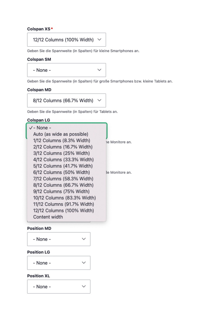
Width (Colspan)
In the Backend you are able to choose how many of the available twelve columns an element of the type "Layout | Column" can capture on different viewports. Inside this "Layout | Column" you can place various content types (e.g. texts, images, videos, lists...)
As you can see, only the declaration of colspans for small smartphones (XS) is a mandatory field and is set to twelve by default. Accordingly the contents of this layout-column run in full width (twelve of twelve columns). The value is inherited from the smallest to the biggest display size as long as it is not overwritten.
Multiple columns are aligned next to each other until all twelve columns are filled or exceeded (7 columns + 7 columns = 14 columns, the elements position below the other) and are left-justified.
Spacings (Position)
The distance to the left side can also be set in the unit "columns". If an element captures six columns for example, further six columns remain. If the element now shall be placed in the middle, the distance to the left side has to be set to three columns (3 columns space + 6 columns of content + 3 columns space = 12 columns).
Breakpoints
The so called breakpoints describe the settings options for different display resolutions.
-
XS = small smartphones (0px - 640px)
-
SM = big smartphones or small tablets (640px - 768px)
-
MD = big tablets (768px - 1024px)
-
LG = small desktop computer or notebooks (1024px - 1280px)
-
XL = big desktop computer (ab 1280px)

How to test your grid settings
-
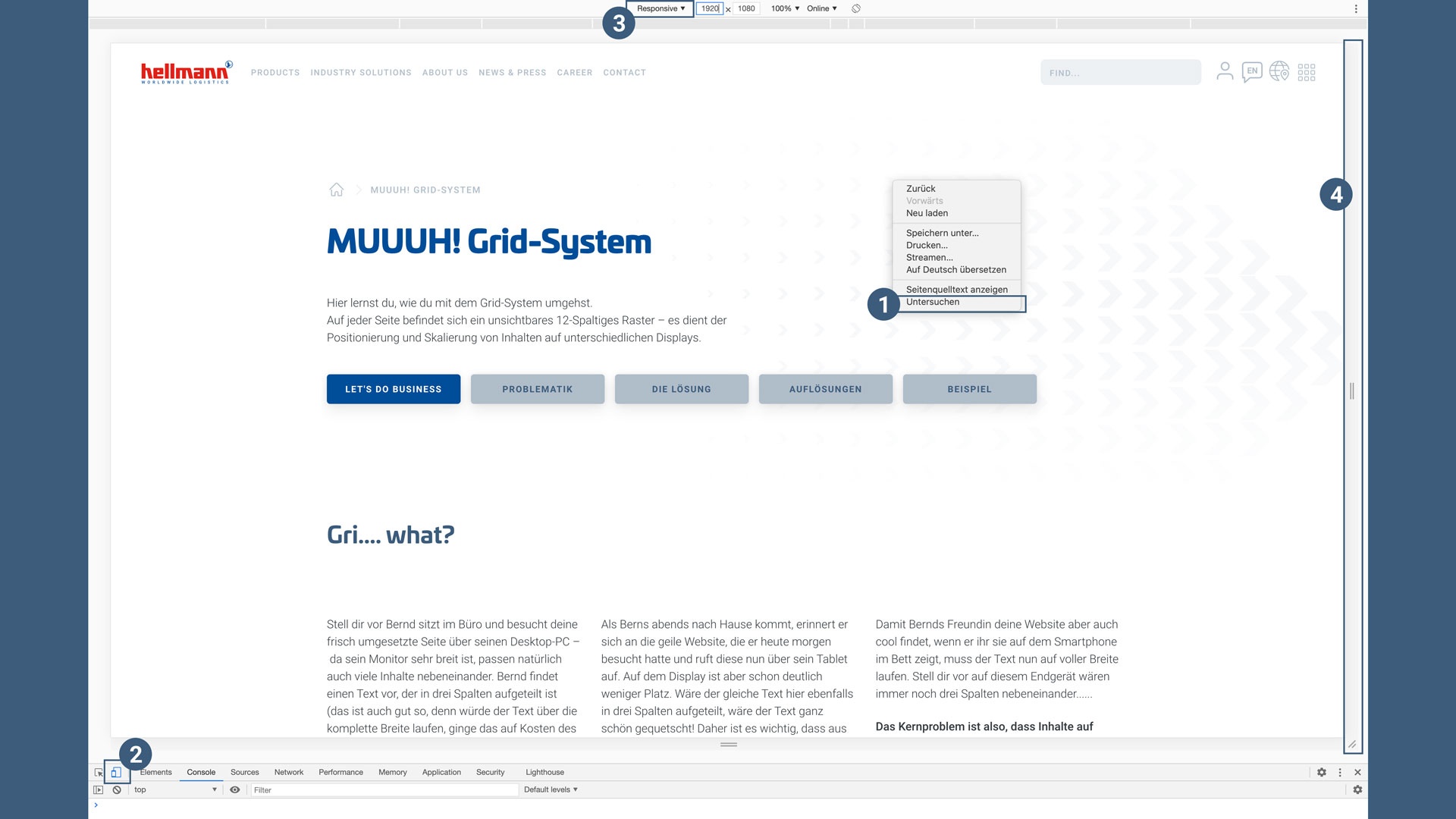
Right click here and choose "Inspect"
-
A window opens, there you click on the small icon with two squares (smartphone and tablet) in the left upper corner.
-
If not already set, choose "responsive"
-
You now have a handle on the right side with which you can resize the website to see how elements behave on different viewports
Visual example
Layout-Column
-
Colspan XS: 12
-
Colspan SM: 6
-
Colspan MD: 4
-
Colspan LG: 3
-
Colspan XL: 2
Layout-Column
-
Colspan XS: 12
-
Colspan SM: 6
-
Colspan MD: 4
-
Colspan LG: 3
-
Colspan XL: 2
Layout-Column
-
Colspan XS: 12
-
Colspan SM: 6
-
Colspan MD: 4
-
Colspan LG: 3
-
Colspan XL: 2
Layout-Column
-
Colspan XS: 12
-
Colspan SM: 6
-
Colspan MD: 4
-
Colspan LG: 3
-
Colspan XL: 2
Layout-Column
-
Colspan XS: 12
-
Colspan SM: 6
-
Colspan MD: 4
-
Colspan LG: 3
-
Colspan XL: 2
Layout-Column
-
Colspan XS: 12
-
Colspan SM: 6
-
Colspan MD: 4
-
Colspan LG: 3
-
Colspan XL: 2